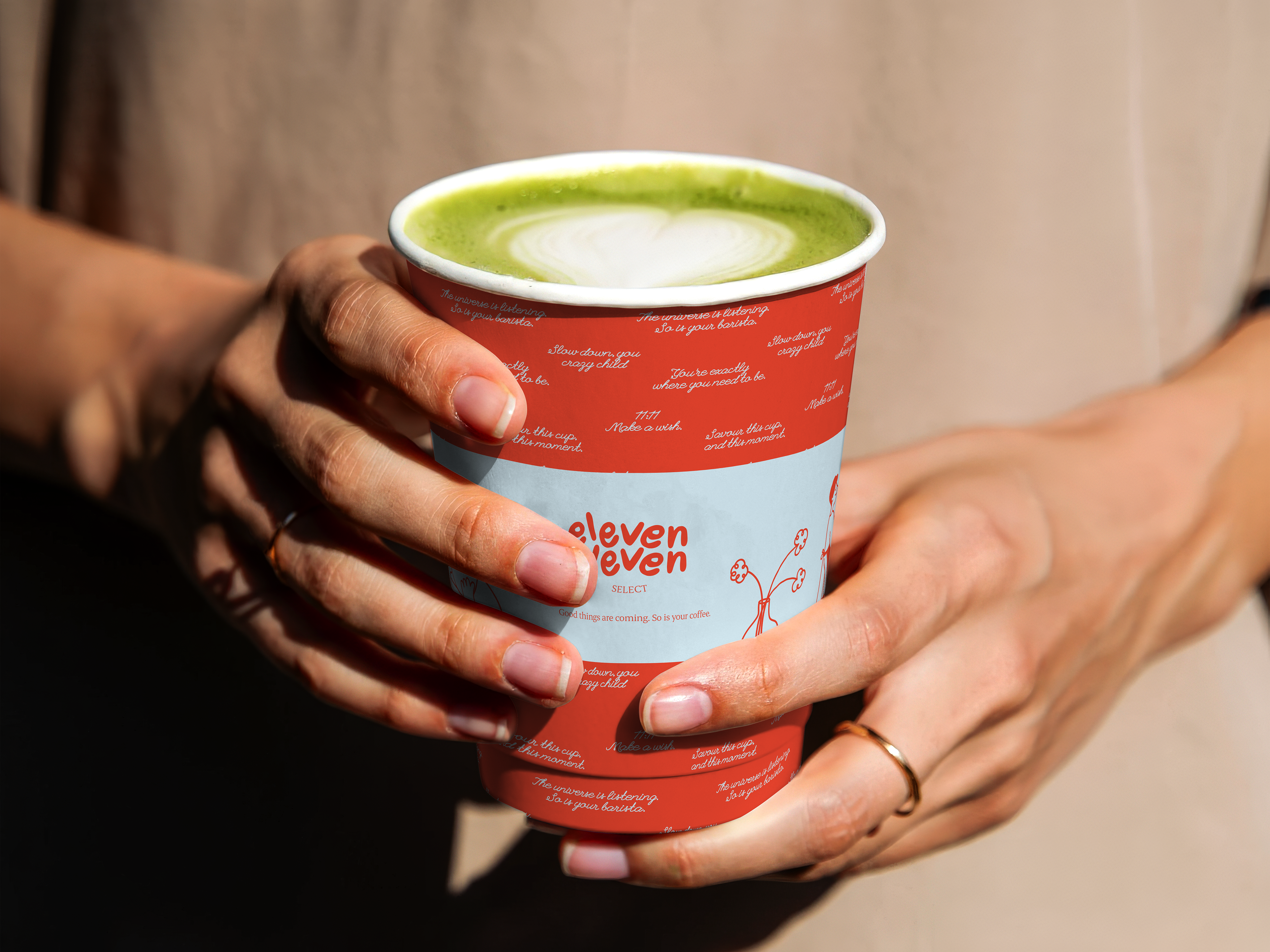
A little context
11:11 came to me as a café concept without a category. It was not just a coffee shop, or a co-working space, or a restaurant. The founders knew the feeling they wanted people to leave with, but hadn't yet defined what the brand needed to say, look like, or promise. The brief itself listed deliverables as "TBD." My first job wasn't design. It was giving the project a shape, and the brand a new life.
Then came the challenge
Chennai's third-space category had split into two camps: places chasing hype and running community events with no substance behind its aesthetic, and cafes so minimal they felt empty. Neither built real loyalty. 11:11 needed a position that wasn't about just looking good in a photo, it needed to earn repeat visits in a city where the competitive set (a hype-led brand, a loud youth-energy brand, a minimal-luxury brand) had already claimed the obvious lanes.
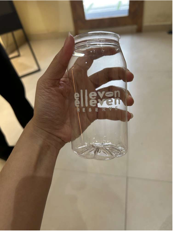
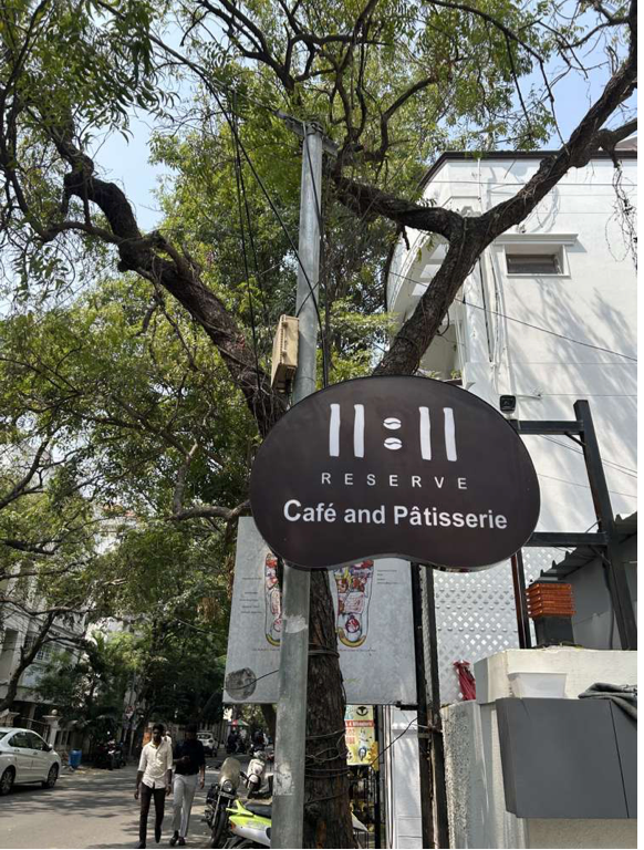
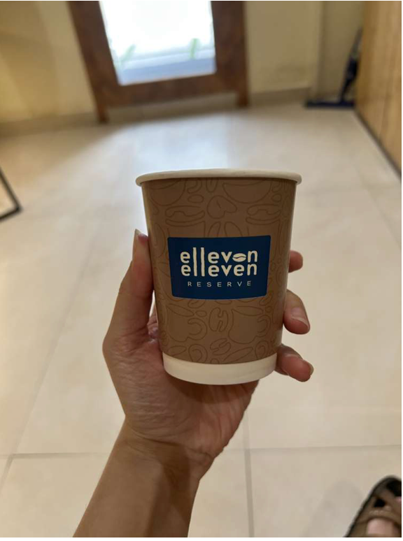
Finding our footing
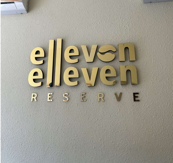
11:11 already existed as a franchise outlet, but the identity still read like any other cafe. The current ask was for the cafe to feel like its own space, not a template. That meant I couldn't just refine what was there, I had to start the research from the ground up, as if the brand didn't exist yet. Competitor and category audits, customer pain-point mapping, and three working personas: a loyal customer who needs the premium feel, a quiet regular customer, a value-driven host, and a digitally fluent early adopter. This gave me a clear understanding of who the brand was for, and, just as importantly, who it wasn't (I wrote 11:11 as an anti-audience to keep the brand from diluting itself by chasing broad appeal).That research pointed to a gap no competitor owned: an intentional reset. I built the brand around a blended archetype with 'Sage' for clarity and intention, 'Lover' for emotional memory, and 'Everyperson' to keep it accessible rather than exclusive. This developed the tone of voice on three pillars: centered, inviting, editorial. With this skeleton as our strategy, I helped the team find an anchor in this statement: "We don't shout. We resonate." This echoed all our design decisions that followed.
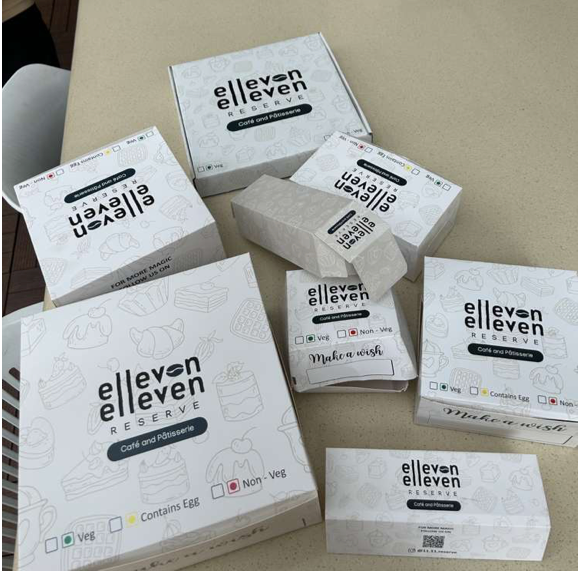
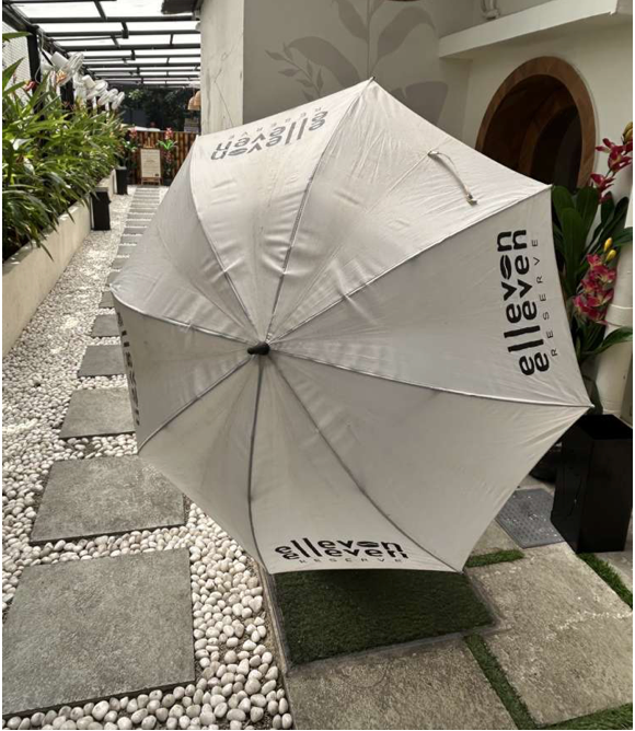
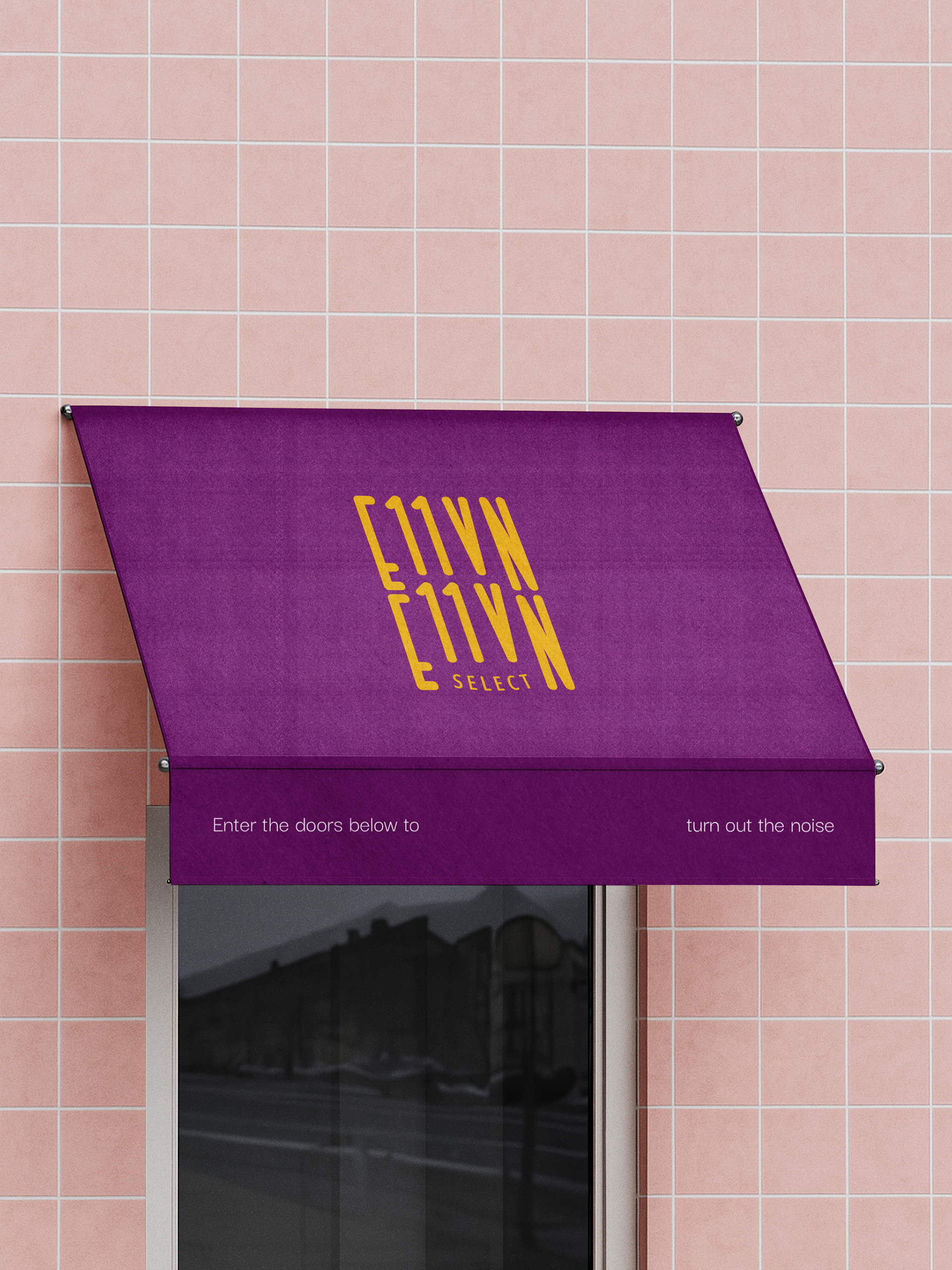
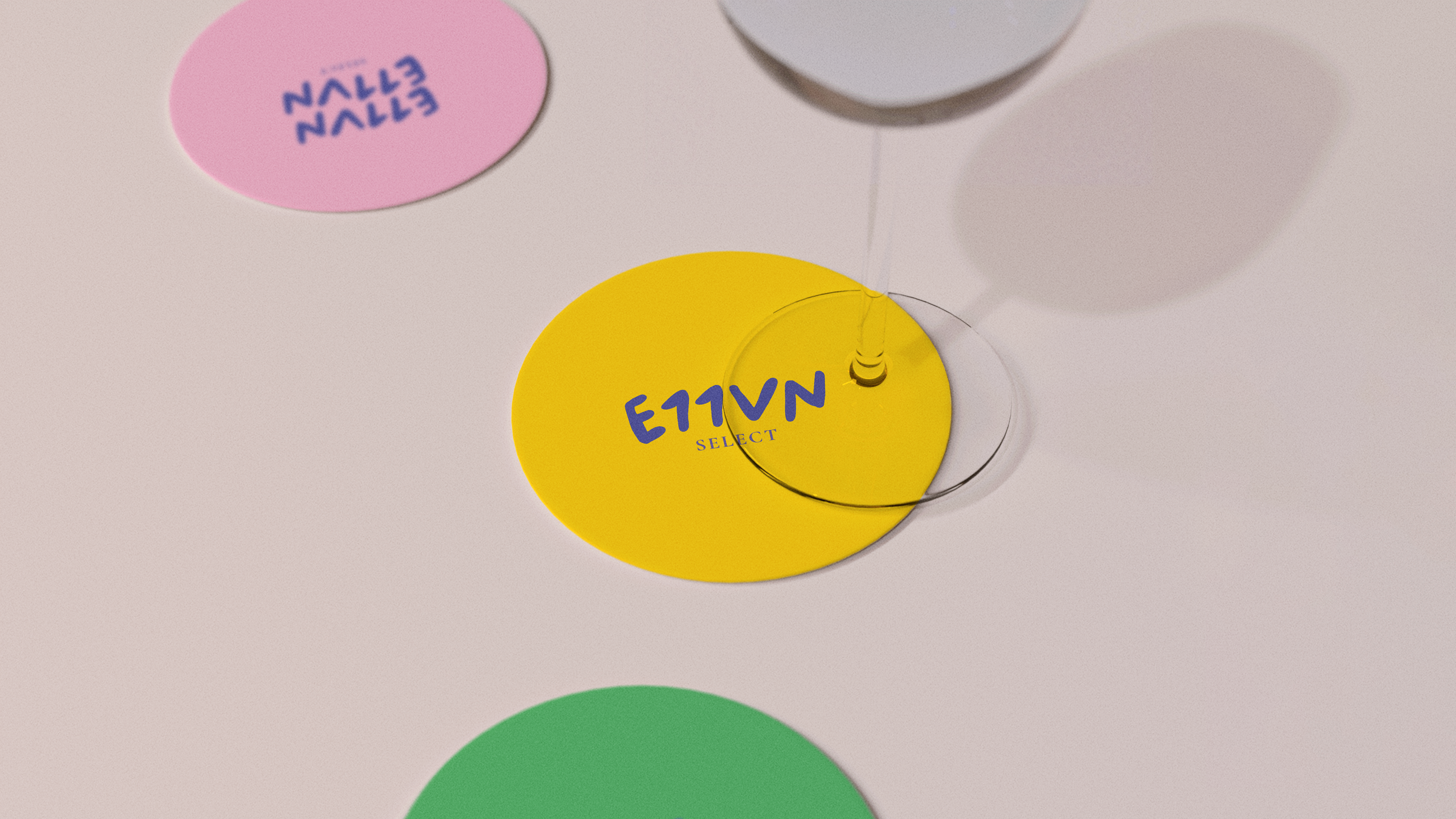
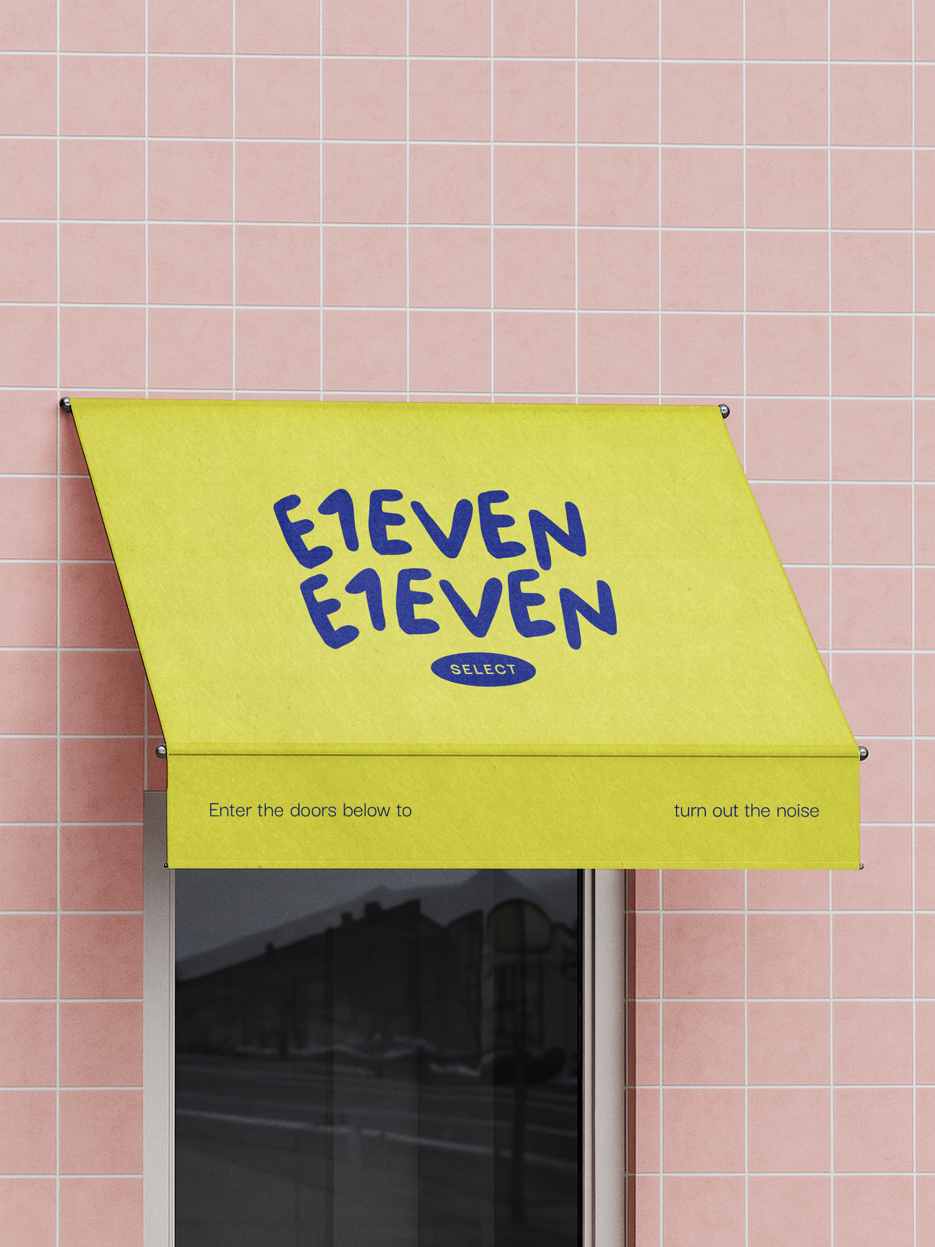
There were a lot of initial iterations:
There were a lot of initial iterations:
The execution that followed
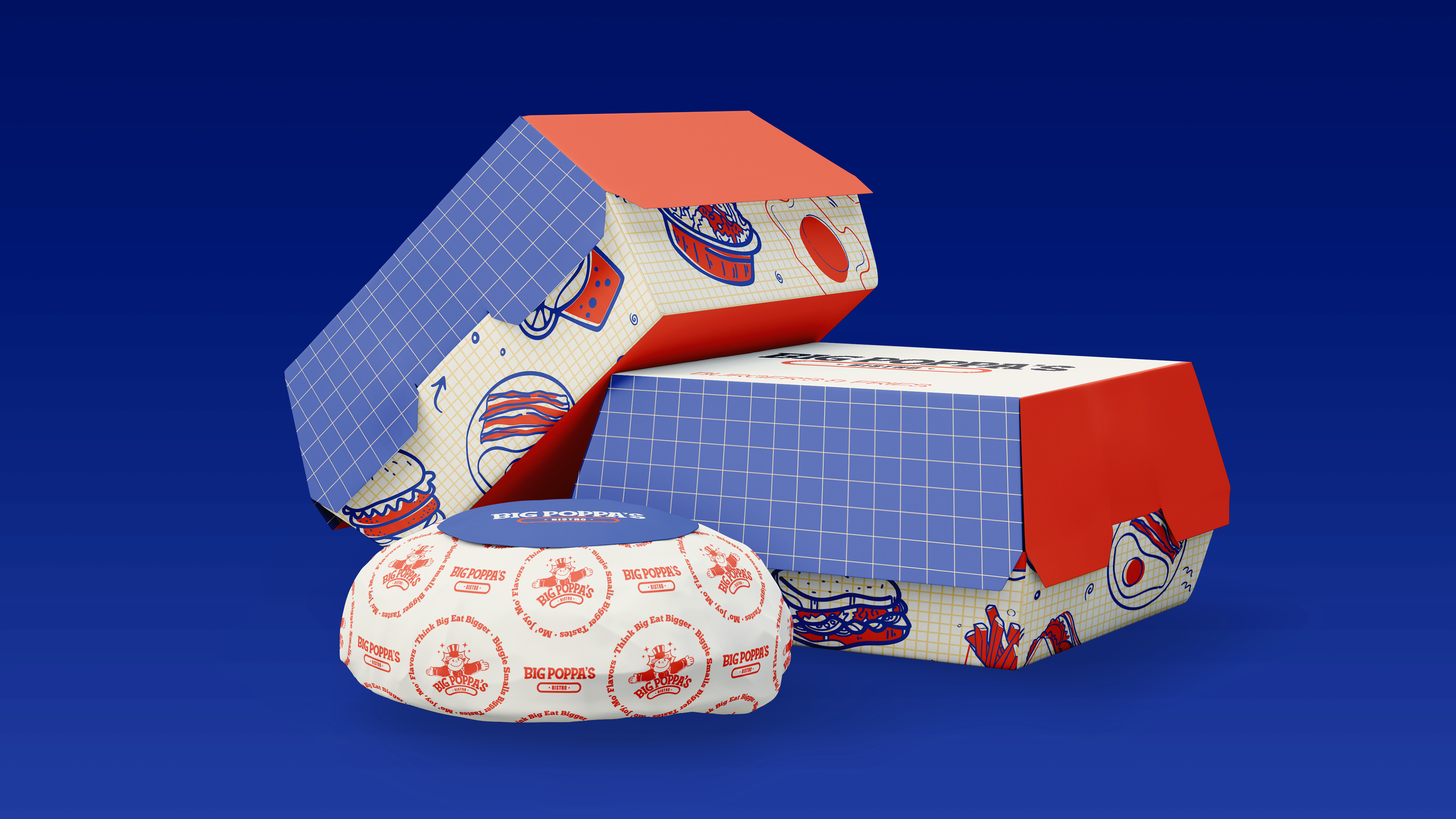
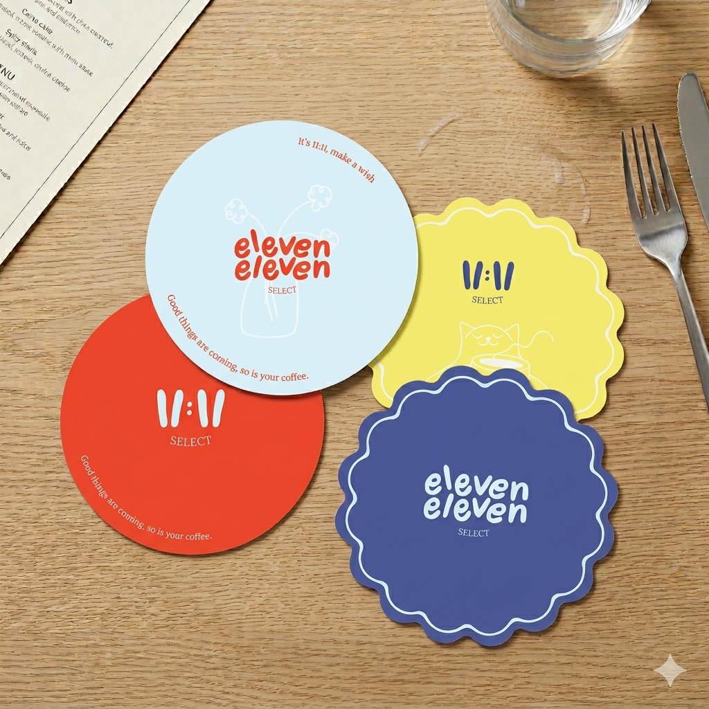
I translated that strategy into a full identity system: a word mark and icon built for boldness in a kind tone. The typography and colour palette add a quiet confidence to this feel, which is, "inviting without trying,". The dual-typeface pairing, also makes the system very dynamic across different channels, a structured grotesque for everyday use, a softer display face for headline moments. The right balance between the calm and the boldness of the brand. I extended the system through packaging, a full brand guideline book, and social templates, so the founders could apply it consistently without needing a designer in the room every time.
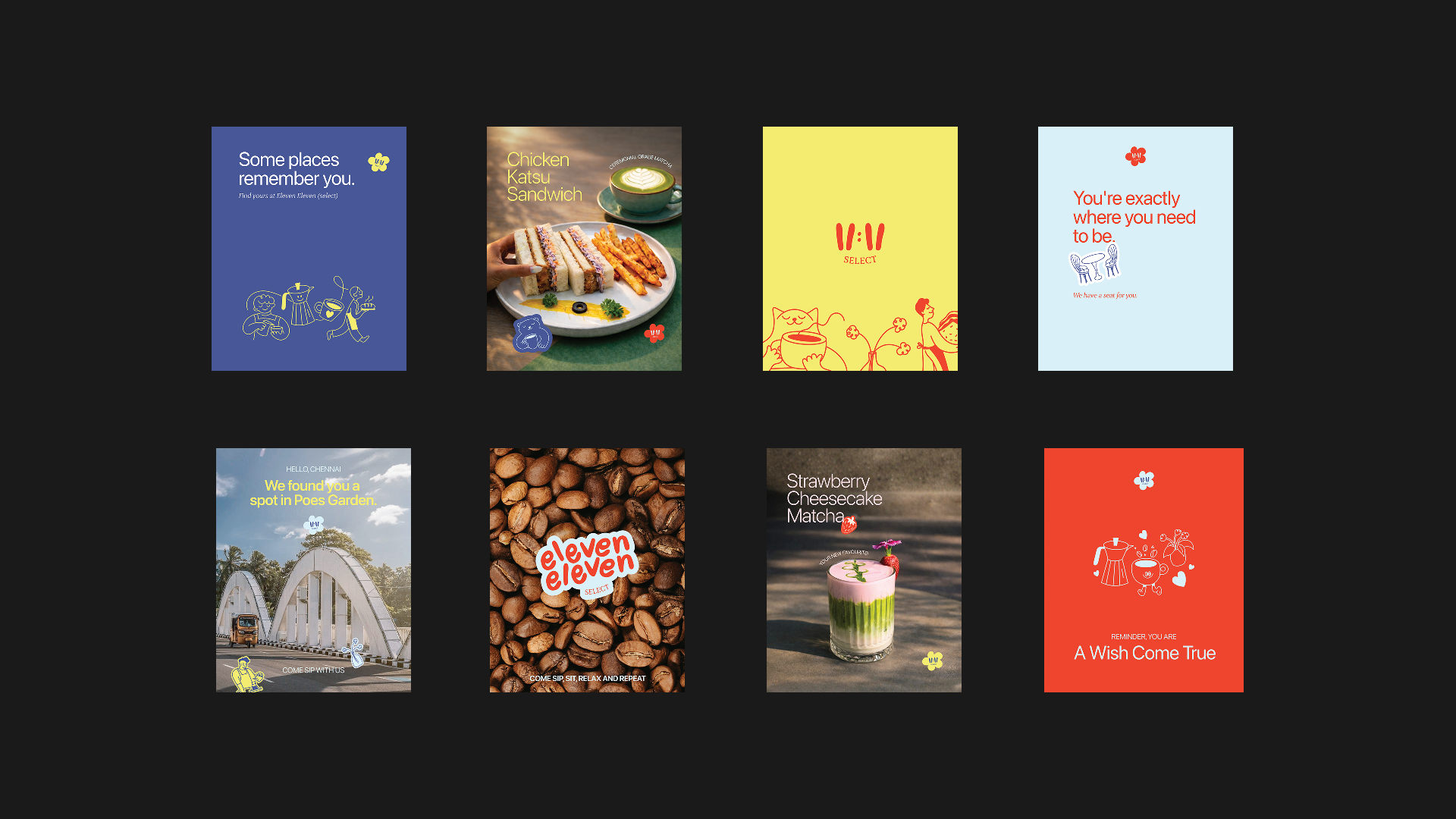
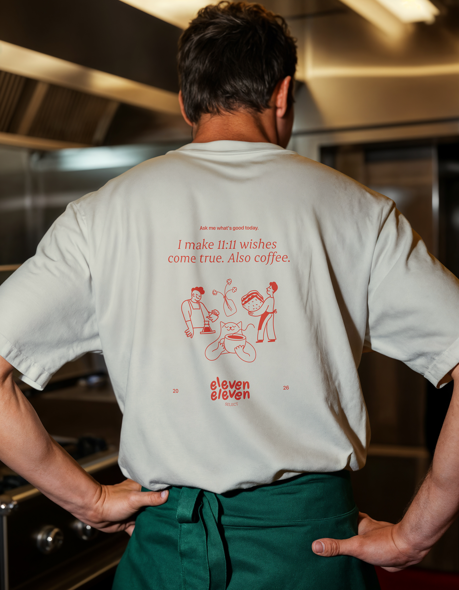
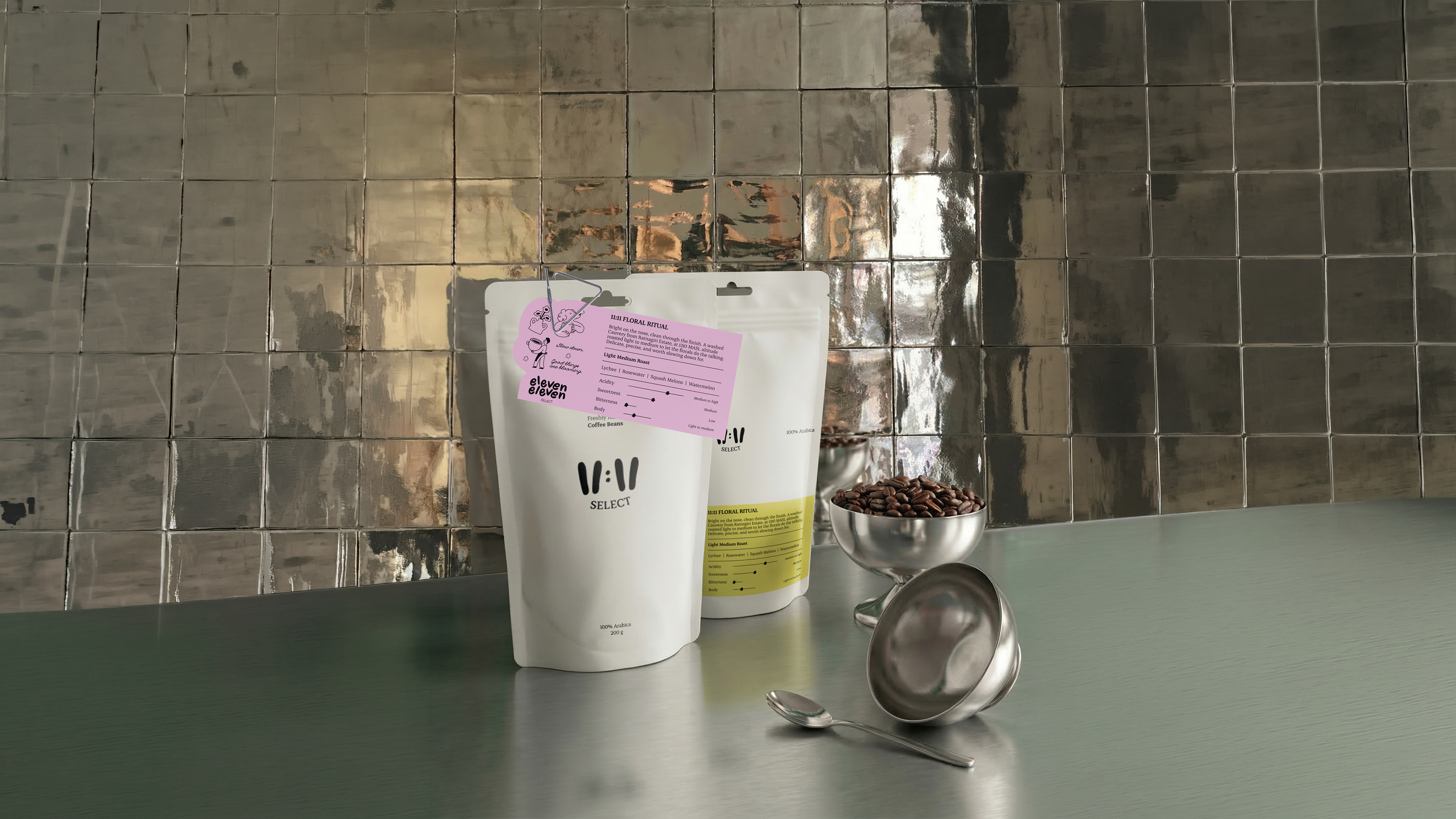
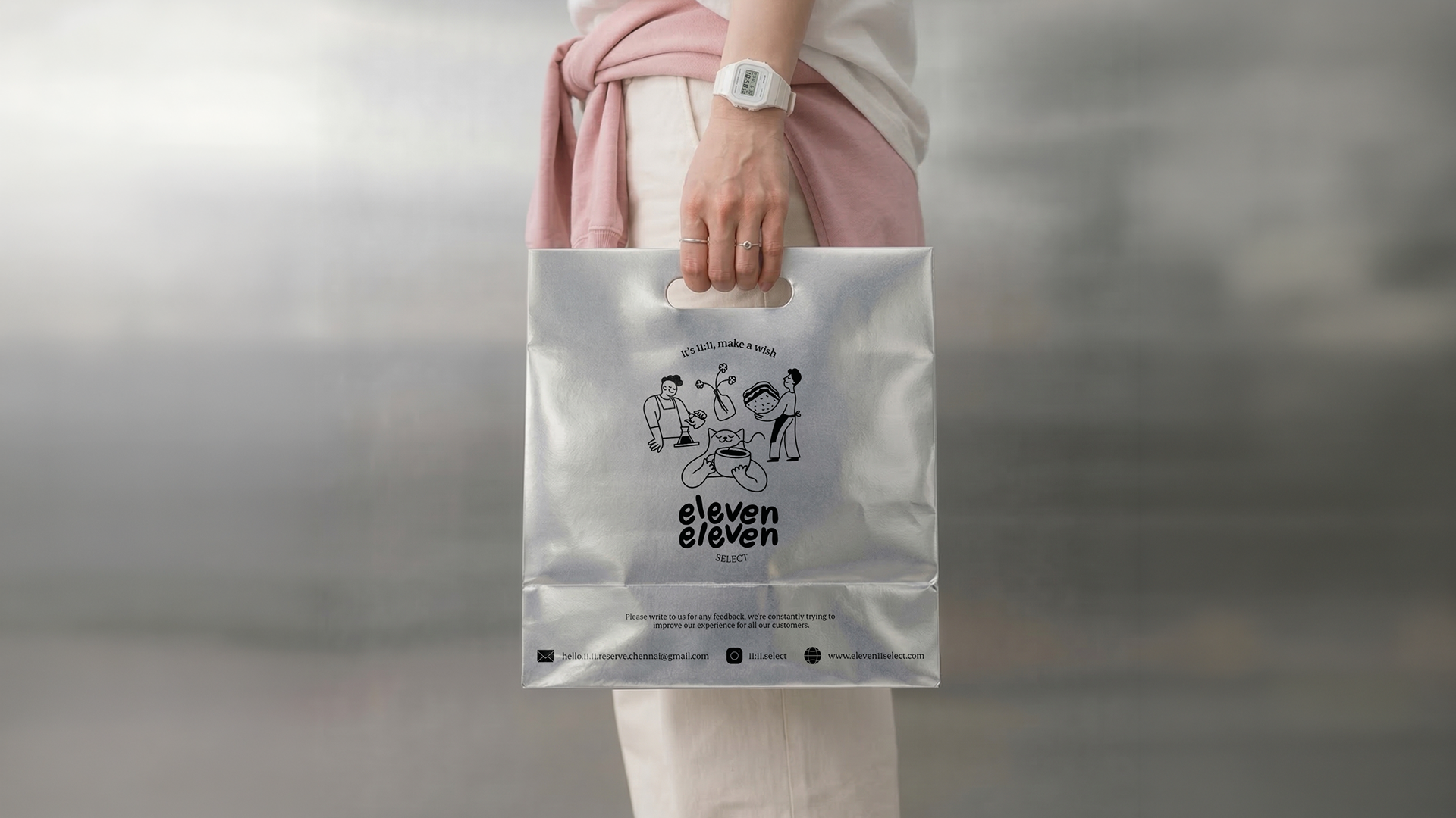
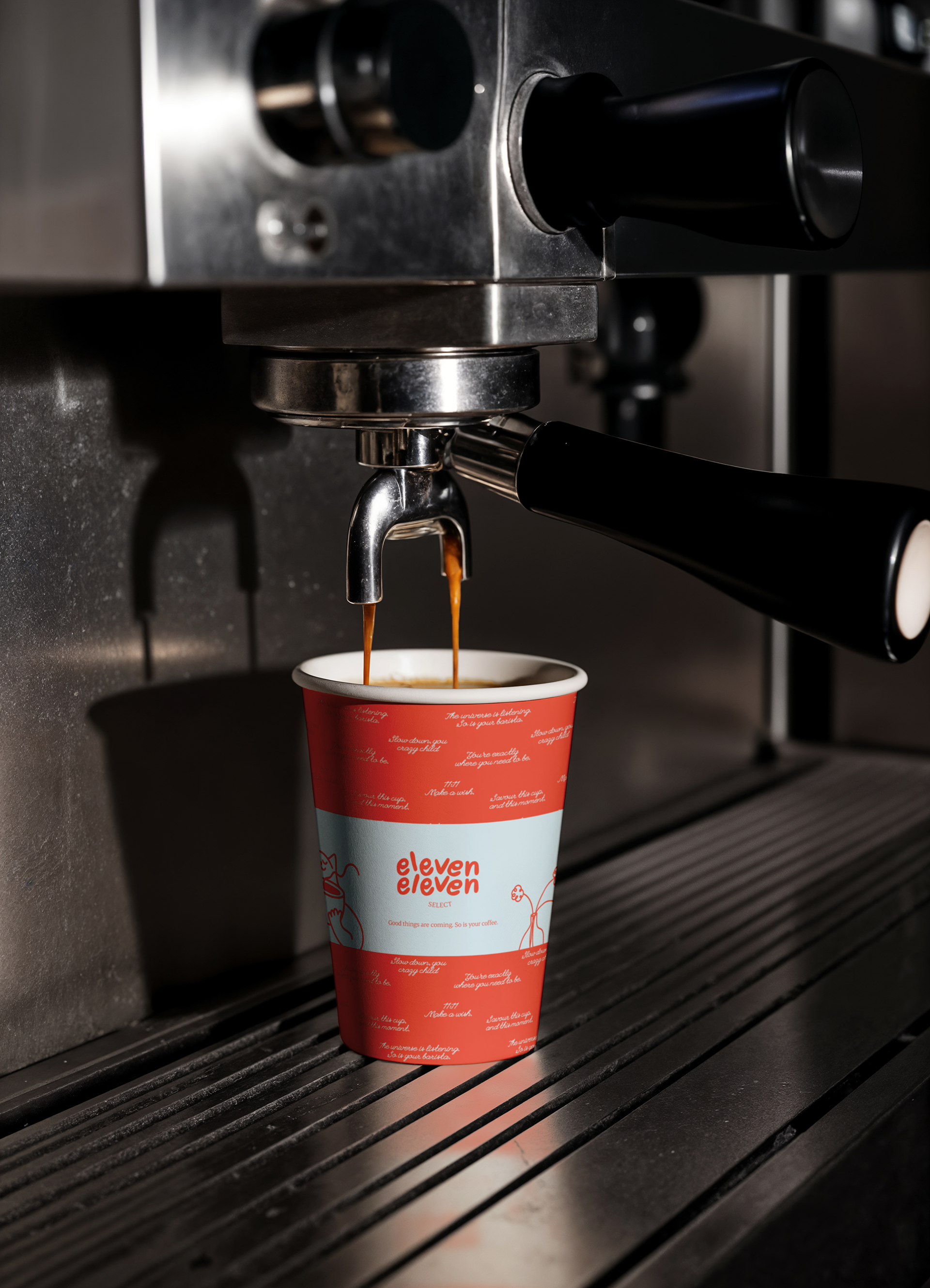
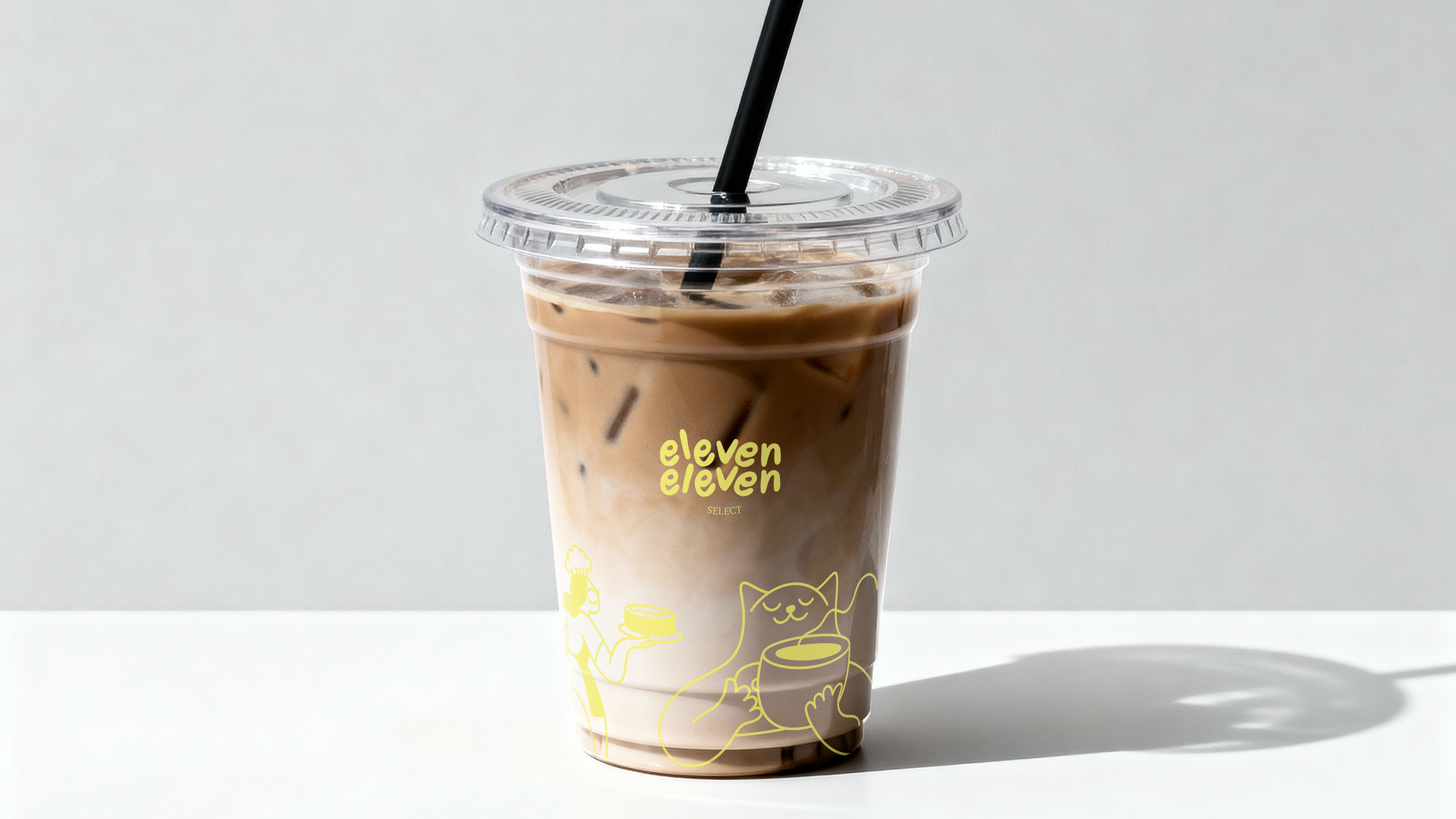
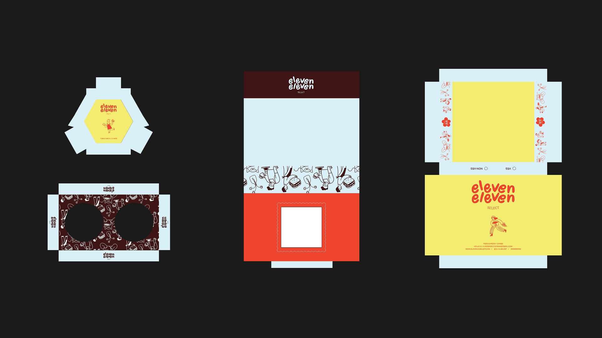
Some deliverables are still rolling out, but the identity is already live where it counts most, in the space itself. The response so far has been genuinely warm, with the colour palette in particular striking a chord with the regulars. What's forming isn't just a café with a consistent look; it's a small community that's being nurtured one visit at a time, which was the whole point of building the brand around intentional reset rather than just aesthetics.