Brief
STYR is more than just a premium quality, unisex graphic t-shirt brand—it's a bold, sarcastic response to the status quo. Our designs are loud, unapologetic, and witty, perfect for those who wouldn’t be caught dead in a basic tee. Whether it's a playful dig at society's absurdities or a clever twist on pop culture, our apparel is your go-to uniform for navigating the chaos with a smirk.
Objective
The logo should capture the essence of STYR's quirky and humorous brand personality. It needs to communicate that STYR is fun, witty, and creative, appealing to a young, urban, and fashion-forward audience.
The logo should be memorable and simple enough to draw by hand.
As STYR expands its product line, the logo should remain relevant and flexible enough to accommodate future growth, including potential sub-brands or product categories.
Strategy
Our strategy was to pivot from the current market of minimal typographic branding of some existing players and create a fun brand that is humorous and doesn’t take things too seriously. Owing to this, we narrowed in on the brand archetype of a ‘jester’. Our target audience is predominantly males between 16-35 years. They are creatively inclined individuals with disposable income. They’re possibly in urban areas, with a focus on cities like Bangalore, Mumbai, and Delhi.
The values they relate to are self-expression, humor, community, and creativity. They are actively engaged on social media, especially platforms like Instagram and YouTube. They follow influencers and trendsetters and appreciate art and design. Outside their professional lives, they enjoy gigs, concerts, travel, and cafes. They value versatility and creative expression.
STYR’s differentiation lies in its ability to blend affordability with one-off witty designs, offering products that are not only statement pieces but also accessible to a broader audience.
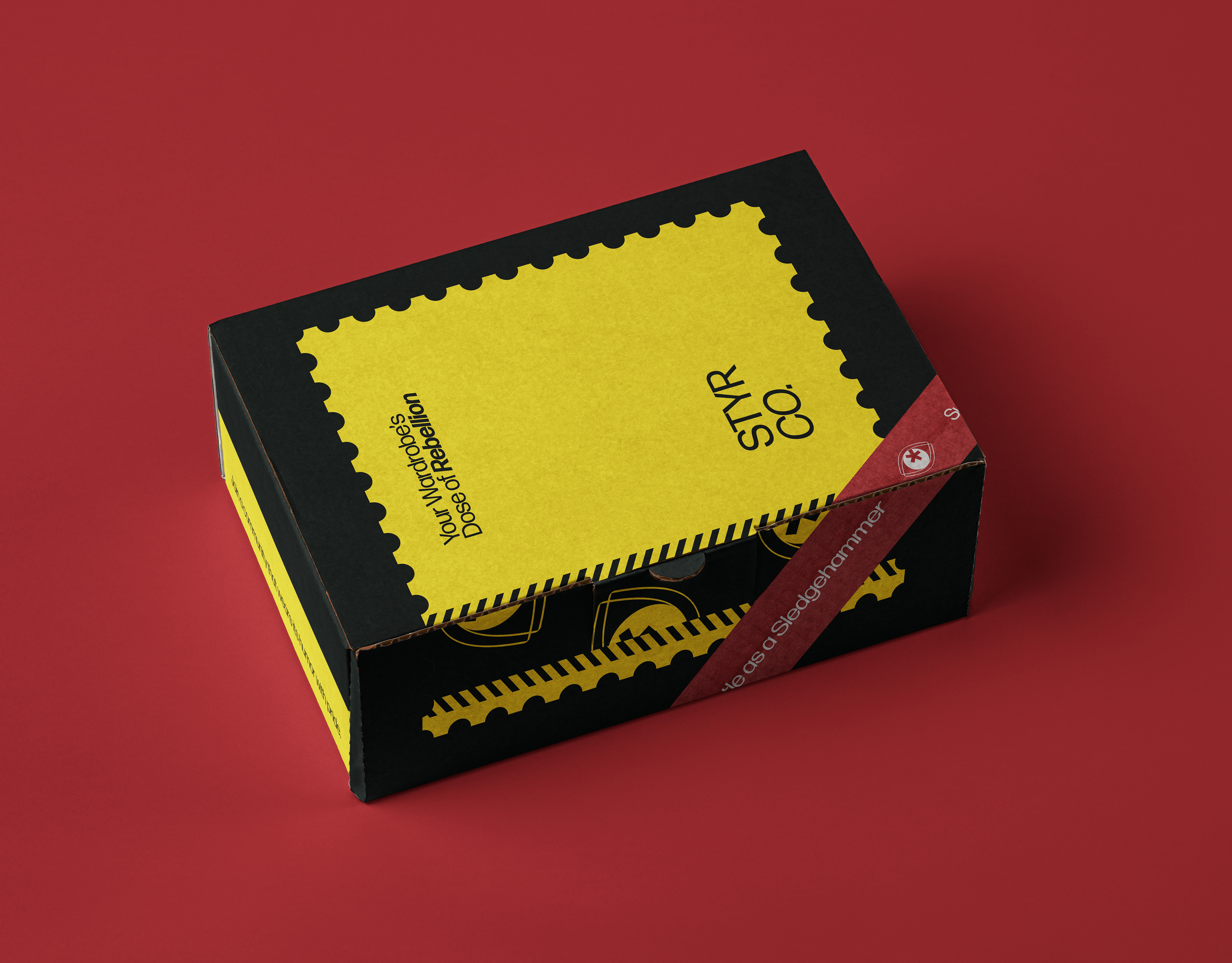
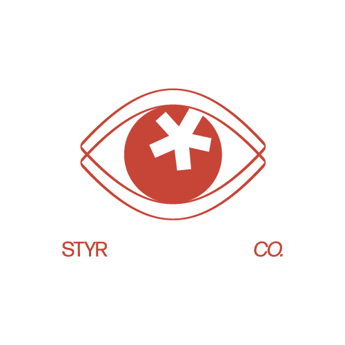

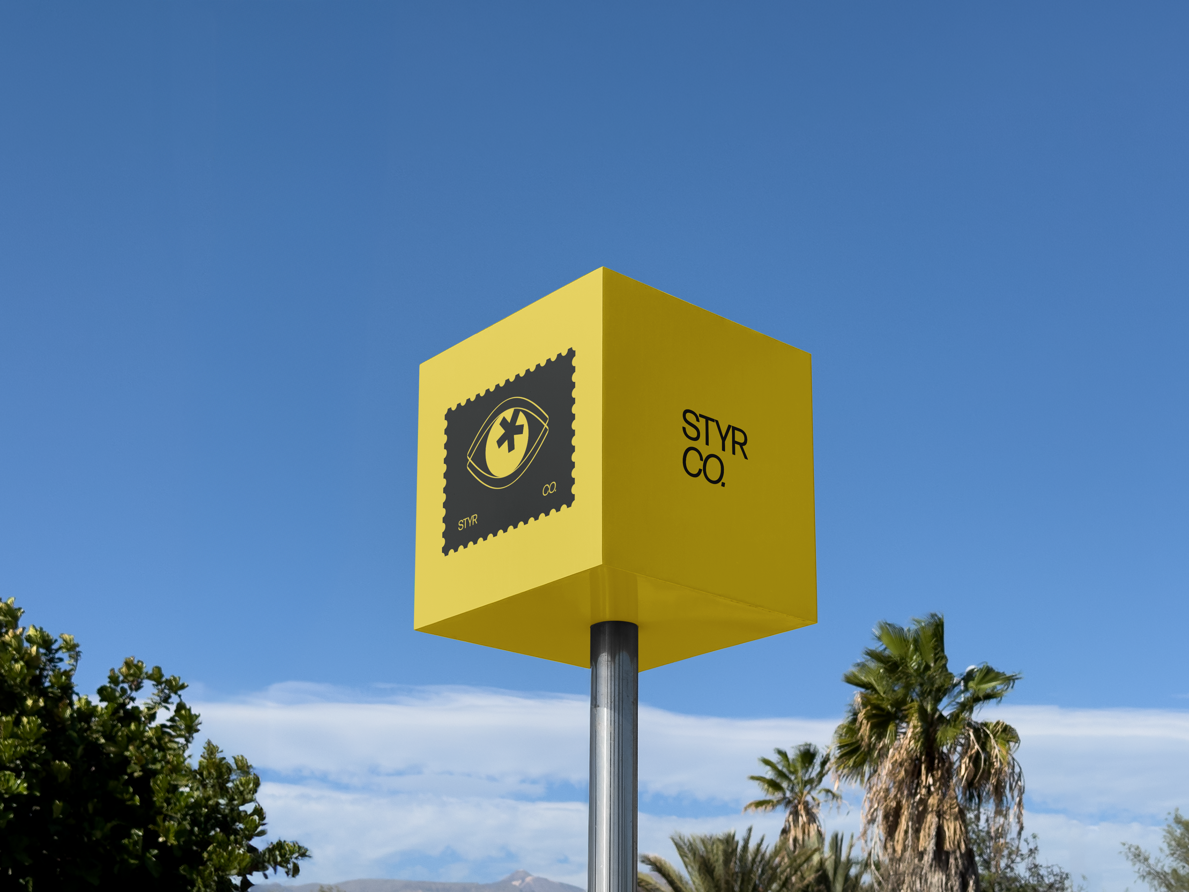
The eye symbol is commonly linked to perception, observation, and awareness, suggesting that the brand is mindful of its bold, 'in-your-face' attitude. The asterisk at the centre introduces an element of censorship, implying that the brand recognises societal taboos but chooses to confront or highlight them. The logo's simplicity ensures it remains striking and memorable across various touch points, from clothing tags to digital platforms. It can also function effectively as a standalone mark.
The other components of the identity, like fonts, typography, and visual imagery, reflect the same in-your-face attitude while still not being too over the top or gaudy. The yellow, black, and white not only serve as a nostalgic reminder of the iconic “Smiley,” but also have an air of playfulness to them.